Section 3: Retaining Walls and Noise Walls
Anchor: #i1008928Overview
Retaining walls and noise walls are strong visual elements since they are vertical and often quite tall. The Roadway Design Manual provides information on placement and structural detailing of walls. This section will discuss walls in terms of their visual relationship to the surrounding landscape and selection of surfaces and finishes.
Anchor: #i1008944Wall Color and Finish
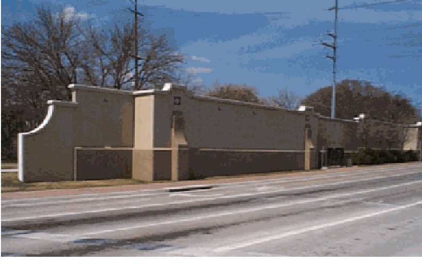
Because walls are strong vertical elements they can dominate the field of view. The color, texture, and pattern of walls have a commanding influence on driver perception of the highway landscape (see Figure 4-1). Depending on the color and texture they will tend to blend or contrast with the background. In most cases the designer should pick colors that blend with the natural surroundings. Scale is also an issue, particularly in residential neighborhoods. Wall heights can be so commanding that they overpower the surrounding homes.
Figure 4-1. The apparent height of noise walls can be reduced with plant material, architectural detailing, and use of color.
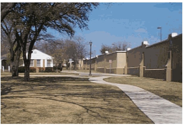
It is important to consider both sides of the wall. The highway side should be designed to fit the driver’s eye view but the opposite side of the wall should consider the impact on the adjacent properties (see Figure 4-2). When tall walls are placed next to single story residences, light colors and fine textures are the most effective. Colors should be muted so that they do not conflict with the color of the residence or its accessories. See the Surface Finishes section for more information on finishes.
Figure 4-2. The house side of sound walls can be a positive visual element for a neighborhood.
Some design considerations that will help guide the selection of colors and finishes include the following:
- Anchor: #ENYQNYED
- Consider using horizontal patterns on the “house-side” of walls to de-emphasize the height. Anchor: #SHCELGXS
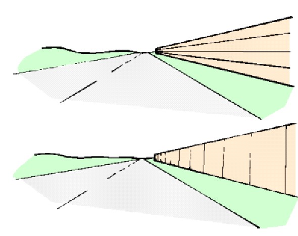
- Vertical texture and rustication patterns tend to be most effective when long sections of wall are visible from the driving lanes. This tends to minimize the apparent visual length of the wall. (See Figure 4-3.) Anchor: #NMYVQELP
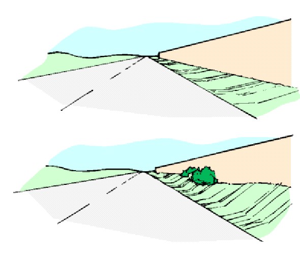
- Where practical, vary the grade along the face of the wall and integrate with planting to minimize the apparent height of the wall. (See Figure 4-4 and refer to Figure 2-8.)
Figure 4-3. The dominant textural lines of walls affect their apparent height.
Figure 4-4. Plants and grade changes can add interest and reduce the apparent size of the wall.
Anchor: #i1009063Vertical Alignment
A significant aspect of wall design from an aesthetic standpoint is the contrast of the horizontal line of the wall with other elements near or behind it. Walls are viewed with the rest of the world as their background. For this reason their elevation view should be considered carefully.
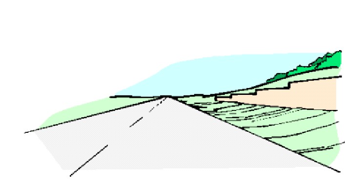
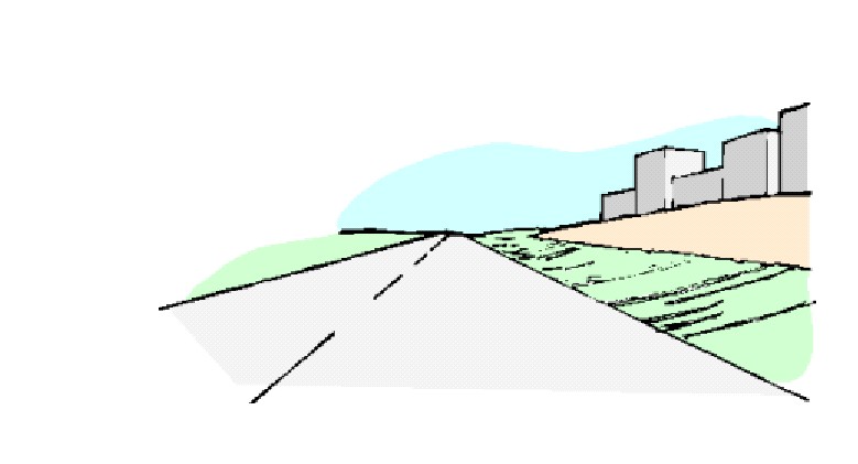
The upper edge of a wall usually contrasts with elements in front of and behind it. This relationship should be considered to avoid visual conflicts with the immediate surroundings comparison. Wall caps that incorporate step-downs to make grade changes may contrast well with the smooth flowing lines of adjacent landscapes (see Figure 4-5). This highlights the wall by setting it apart from the background, making it an even more dominant visual element. The same elevation may add an element of visual confusion to an urban scene filled with a lot of multistory buildings (see Figure 4-6).
Figure 4-5. Wall profiles that increase the contrast between the wall and background make the wall more visually prominent.
This highlights the wall by setting it apart form the background, making it an even more dominant visual element.
The same elevation may add an element of visual confusion to an urban scene filled with a lot of multistory buildings(see Figure 4-6).
Figure 4-6. A smooth wall profile is often a pleasant contrast to more complex urban backdrops.
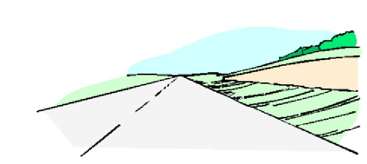
Wall caps that mimic or follow the shape of the background will tend to be less obtrusive (given similar influences of color, etc.) by blending its form with the surrounding landscape (see Figure 4-7). Wall caps should generally use their entire length to make grade changes if possible. If this is not feasible, elevation changes should be spaced uniformly within the varying section to provide a sensible, uniform rhythm. Avoid oddly spaced or uneven elevation changes and inconsistent angles or radiuses.
Figure 4-7. Wall profiles that mimic their backgrounds are less visually prominent.
