Section 4: Guide Sign Layout
Anchor: #i1008073Introduction
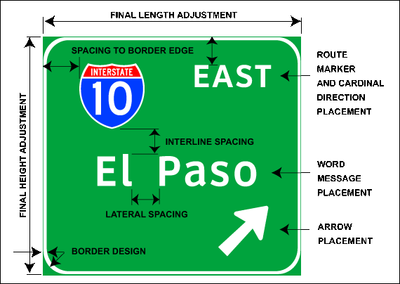
This section provides general guidelines on the layout of freeway guide signs. Many of these guidelines are provided in the Texas MUTCD, Standard Highway Sign Designs for Texas, Traffic Engineering Standard Sheets, and the Traffic Operations Manual: Signs and Markings Volume. Others are derived from accepted TxDOT practice. Figure 4-11 illustrates the design components covered in this section.
Figure 4-11. Design components covered in Section 4 – Guide Sign Layout.
This section primarily addresses the sign layout of Advance Guide and Exit Direction signs. Signs with standardized messages, such as Exit Gore signs and Guide Sign Number panels, are fixed to standard sizes given in the Standard Highway Sign Designs for Texas. These standards also include specifications on letter style, letter size, lateral spacing, placement, and border design.
Anchor: #i1008104Border Design
The message on the sign controls the overall size of the sign. Once the message content has been spaced on the sign, a border should be added to all edges of the sign. The layout guidance given in this section is spaced to the inside edge of the border. The final length and height adjustment, including the border, are discussed in the Final Length and Height Adjustment segment at the end of this section.
With a few exceptions, the Texas MUTCD requires all signs to have a border of the same color as the legend. The border widths should be of similar proportions but not exceed the stroke width of the major lettering of the sign. Depending on the signing document, guidance on border widths may vary. The following table provides general guidance regarding border widths based on sign panel area.
|
Total Sign Panel Area (square feet) |
Border Width (inches) |
|---|---|
|
< 60 |
1.0 |
|
|
2.0 |
The corners of all sign borders must be rounded, and where practicable, the corners of the sign panels should also be rounded to fit the border. It is not practical to round the corners on sign panels made with extruded aluminum blanks. On guide signs, the corner radii of sign borders should be approximately one-eighth the lesser side dimension, except the radii should not exceed 12 inches on any sign. The area outside the corner radius may need to be trimmed, except for signs made from extruded aluminum panels. The following table shows general guidance regarding corner radii based on sign height.
|
Sign Height (feet) |
Corner Radii (inches) |
|---|---|
|
< 6 |
9 |
|
|
12 |
Anchor: #i1008136
Lateral Spacing
The lateral spacing between two-word messages in a single line of copy should be equal to the uppercase letter or capital letter in the given line of text (Figure 4-12).
Figure 4-12. Lateral spacing between two-word messages.
The lateral spacing between a word and an arrow (upward or downward) should be equal to 1.5 times the uppercase letter or capital letter in the given line of copy (Figure 4-13).
Figure 4-13. Lateral spacing between a word and an arrow.
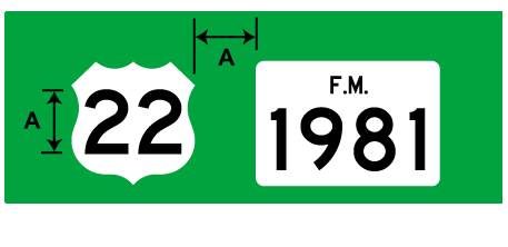
The lateral spacing between a word and a Route sign should be equal to the largest letter height in the given line of copy. The largest letter height may come from the Route sign numeral or the text message (Figure 4-14).
Figure 4-14. Lateral spacing between a word and a Route sign.
The lateral spacing between a word and a mileage numeral should be one times the uppercase letter height in a given line of copy (Figure 4-15).
Figure 4-15. Lateral spacing between a word and a mileage numeral.
If two or more Route signs are in the same line of copy, the spacing between individual signs should be equal to the height of the largest numeral within the Route signs (Figure 4-16).
Figure 4-16. Lateral spacing between Route signs.
Lateral spacing of arrows and text messages in exit only and left exit panels may differ and are standardized in the Traffic Engineering Standard Sheets.
Anchor: #i1008234Interline Spacing
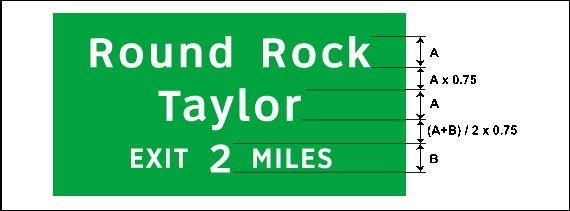
The interline spacing between capitalized or uppercase words should be approximately three-fourths (¾) the average capital or uppercase letter height in adjacent lines of text (Figure 4-17). For message text that includes a mileage numeral, the interline spacing should be determined with the numeral height and spaced between the common line of text (Figure 4-17). In no case may the interline spacing be less that one-half (½) the average.
Figure 4-17. Interline spacing between word messages.
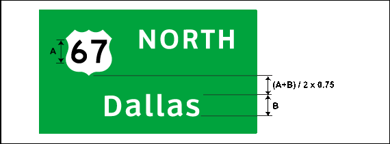
The interline spacing between a Route sign and the line of copy below should be equal to three-fourths (¾) the average height of the numeral in the Route sign and the largest letter, numeral, or arrow in the line of copy (Figure 4-18). The interline spacing should then be between the lowest point on the Route sign and the top of the line of text.
Figure 4-18. Interline spacing between a Route sign and a word message.
The interline spacing between a line of text and an upward sloping arrow should be equal to three-fourths (¾) the height of the uppercase letters in the line above the arrow (Figure 4-19).
Figure 4-19. Interline spacing between a word message and an arrow.
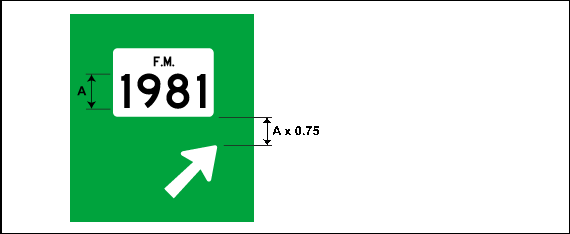
The interline spacing between a Route sign and an upward sloping arrow should be equal to three-fourths (¾) the height of the numerals inside the Route sign (Figure 4-20).
Figure 4-20. Interline spacing between a Route sign and an arrow.
Anchor: #i1008309Word Message Placement
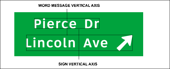
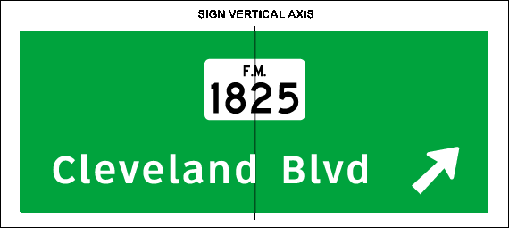
The placement of word messages is dependent on the type of freeway guide sign. For most guide signs, word messages are centered on the vertical axis of the sign (Figure 4-21).
Figure 4-21. Word message placement on an Advance Guide sign.
The placement of word messages on an Exit Direction sign depends on the location of the arrow. If the arrow is the only character in the bottom line of copy (preferred), the word messages should be centered on the vertical axis of the sign (Figure 4-22).
Figure 4-22. Word message placement on an Exit Direction sign.
If the word message and the arrow are the only line of copy on the sign, the word message and arrow should be correctly spaced laterally and centered on the sign (Figure 4-23).
Figure 4-23. Word message placement on an Exit Direction sign with the word message and arrow on the same line of copy.
If the arrow is located on the right or left side of the sign, the longest word message should be correctly spaced laterally with the arrow and centered on the vertical axis of the sign. The smaller lines of copy should then be centered with the longest word message (Figure 4-24). Route sign and arrow placement for Exit Direction signs is discussed later in this chapter.
Figure 4-24. Word message placement on an Exit Direction sign with two word messages and an arrow on the last line of copy.
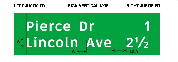
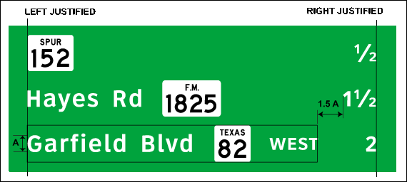
The placement of word messages on interchange sequence series and distance signs is based on lateral border spacing and has equal edge-spacing left and right for all message lines, regardless of message length. The lateral spacing between two words should be equal to the uppercase letter or capital letter in the given line of text. For the longest word message and associated mileage numeral, the lateral spacing between the word message and the mileage numeral should be equal to 1.5 times the uppercase or capital letter height in the given line of text, and the whole line should be centered on the sign. The remaining word messages should be left justified with the longest word message and the associated mileage numerals should be right justified (Figure 4-25).
Figure 4-25. Word message placement on an Interchange Sequence sign.
Anchor: #i1008400Route Sign and Cardinal Direction Placement
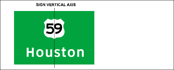
Route signs should be located either above or beside a word message. When placed above a word message, the Route sign should be centered with the word message on the vertical axis of the sign (Figure 4-26).
Figure 4-26. Route sign placement.
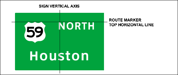
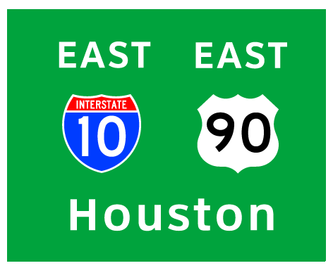
Cardinal directions and words or abbreviations such as BUSINESS, ALT, JCT, and TO may be placed either above or beside the Route sign. The preferred placement is to the side of the Route sign, unless there are two Route signs on the same panel. When placed to the side of a Route sign, the top of the message should be on the same horizontal line as the top of the Route sign (Figure 4-27). Cardinal directions or the word BUSINESS should be located to the right of the Route sign.
Figure 4-27. Route sign and cardinal direction placement.
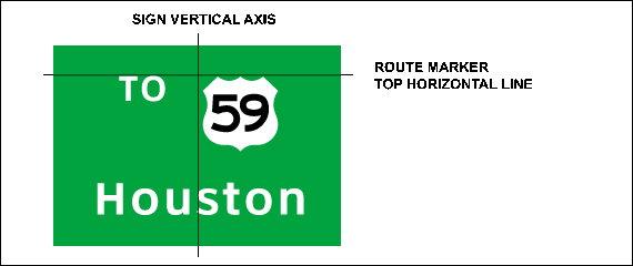
The JCT and TO should be located to the left of the Route sign (Figure 4-28).
Figure 4-28. Route sign and TO placement.
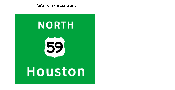
When a cardinal direction is placed above the Route sign, the message should be centered about the vertical axis of the shield (Figure 4-29).
Figure 4-29. Cardinal direction placement when located above Route sign.
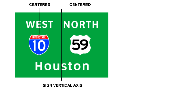
For two Route signs on a sign, the cardinal direction and other words should be located above and centered on the Route sign (Figure 4-30). If the width of the cardinal direction line of copy is greater than that of the Route signs, the cardinal direction line of copy should be centered accordingly, and the Route signs should be centered to the respective cardinal directions.
Figure 4-30. Placement of two Route signs and cardinal directions.
If two Route signs with the same cardinal direction are on a sign, a cardinal direction should be associated with each Route sign (Figure 4-31).
Figure 4-31. Placement of two Route signs with the same cardinal direction.
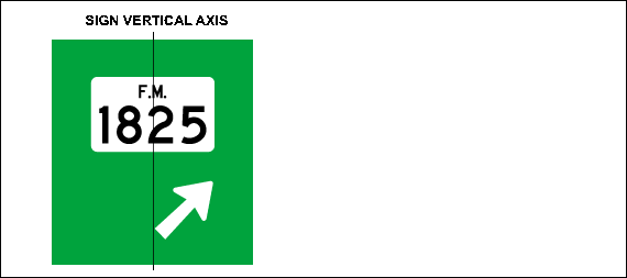
If the arrow is the only character in the bottom line of copy, the Route sign should be centered on the vertical axis of the sign (Figure 4-32).
Figure 4-32. Route sign placement above an arrow on the last line of copy.
If the arrow is located on the word message below the Route sign, the word message and arrow should be correctly spaced and centered on the vertical axis of the sign. The Route sign should also be centered on the sign (Figure 4-33). Arrow placement on Exit Direction signs is discussed later in this section.
Figure 4-33. Route sign placement above a word message and an arrow on the last line of copy.
Route signs should be used for all numbered routes on interchange sequence series signs. Minimum shield heights should be 36 inches for Interstate routes, and 24 inches for U.S. and state routes.
The placement of Route signs on interchange sequence is based on lateral border spacing and has equal edge-spacing left and right for all message lines, regardless of message length. Sequence signs must list street names left most, followed by Route signs, cardinal directions, and distances. The longest destination message and mileage numeral should be correctly spaced laterally and be centered on the sign. The remaining word messages should be left justified with the longest destination message, and the associated mileage numerals should be right justified (Figure 4-34).
Figure 4-34. Route sign placement on an interchange sequence sign.
Anchor: #i1008567Arrow Placement
Arrows are used on guide signs to indicate directions toward designated routes and destinations. As discussed earlier in this chapter, the type of arrow used on a particular guide sign is dependent on the type of guide sign. Standard arrow specifications are shown in the Standard Highway Sign Designs for Texas.
On Exit Direction signs, both overhead and ground mounted, the “Up” arrow must be upward slanting and be located on the appropriate side of the sign. The arrow placement angle should point upward at 45 degrees from the horizontal representing the alignment of the exit roadway.
For Exit Direction signs with a one-word message destination, the arrow should be placed on the next line of copy and right justified on the above destination message (Figure 4-35).
Figure 4-35. Preferred arrow placement with one word message.
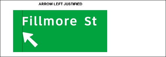
In some cases, the width of an Exit Direction sign may be restricted due to the location, placement, and proximity of other freeway guide signs. In these cases, the roadway designation or type abbreviations (i.e., Rd, Blvd, St) may be placed on the second line of copy with the arrow and left justified with the above word message (Figure 4-36). The minimum spacing between the word and the arrow should be at least 1.5 times the uppercase letter height of the word.
Figure 4-36. Arrow placement with roadway designation on the last line of copy.
If the arrow must be placed on the same line of copy as the destination message, the message and arrow should be laterally spaced and centered on the vertical axis of the sign. The arrow should then be centered vertically on the horizontal axis of the message (Figure 4-37).
Figure 4-37. Arrow placement with word message on the same line of copy.
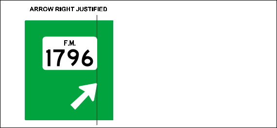
For Exit Direction signs with a Route sign as the single destination message, the arrow should be placed on the next line of copy and right justified with the Route sign (Figure 4-38).
Figure 4-38. Arrow placement with Route sign.
For left-exit Exit Direction signs with one destination message, the arrow should be slanted at 45 degrees from the horizontal to the left, located on the last line of copy, and left justified with the destination message (Figure 4-39).
Figure 4-39. Arrow placement with one word message for a left exit.
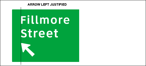
If there are restrictions on the width of the sign, and the roadway designation or type (street, road, etc.) must be located on a separate line of copy, the roadway designation should be left justified on the top word message. The arrow should be placed on its own line of copy and left justified with the word messages (Figure 4-40).
Figure 4-40. Arrow placement with roadway designation on the second line of copy.
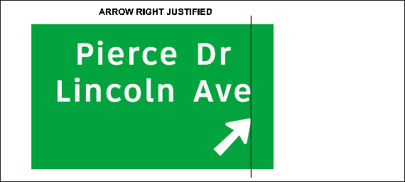
For an Exit Direction sign with two lines of copy, the arrow should be placed on the next line of copy and right justified with the longest destination message (Figure 4-41).
Figure 4-41. Preferred arrow placement with two word messages.
If the arrow is placed to the right of a two word message destination, the longest word message and arrow should be laterally spaced to determine the width of the sign. The arrow should then be centered on the last line of copy or centered on the sign horizontal axis (Figure 4-42 and Figure 4-43).
Figure 4-42. Arrow placement with two word messages, longest word message on the last line of copy, and arrow located to the right of the messages.
Figure 4-43. Arrow placement with two word messages, longest word message on the top line of copy, and arrow located to the right of the messages
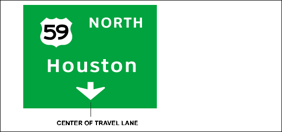
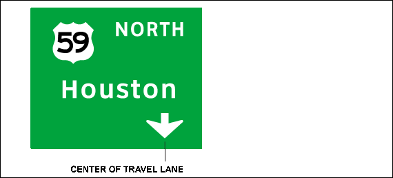
On overhead signs where it is desired to indicate a lane to be followed, the arrow should point downward toward the center of that lane (Figure 4-44). Downward arrows should not be used unless an arrow can be pointed to each lane that can be used to reach the destination shown on the sign. It is preferred that the arrow be centered horizontally on the sign (Figure 4-44); however, the arrow does not have to be centered on the sign as long as it can point to the travel lane (Figure 4-45)
Figure 4-44. Downward arrow placement when sign is located in the center of the travel lane.
Figure 4-45. Downward arrow placement when sign is not located in the center of the travel lane.
Sign design and arrow placement details associated with Exit Only panel signs are presented in the Standard Highway Sign Designs for Texas.
Anchor: #i1008770Spacing to Border Edge
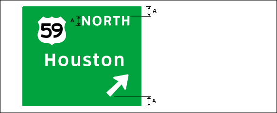
The spacing from the lower edge of the top border to the nearest line of copy should be approximately equal to, but in no case less than, one-half the average of the letter or numeral height in the first line of copy (Figure 4-46).
Figure 4-46. Spacing from top border to the nearest line of copy.
The spacing from the upper edge of the bottom border to the nearest line of copy should be approximately equal to the average of the letter or numeral height in the last line of copy. If the last line copy contains a mileage numeral, the bottom border spacing should be between the upper edge of the bottom border and the lower edge of the common line of text (Figure 4-47).
Figure 4-47. Spacing from the bottom border to the nearest line of copy.
If an arrow is the only element in the last line, spacing between the lowest point of the arrow and the upper edge of the bottom border must be the same as the spacing at the top of the sign (Figure 4-48).
Figure 4-48. Spacing between the bottom and top border when the arrow is the only element in the last line of copy.
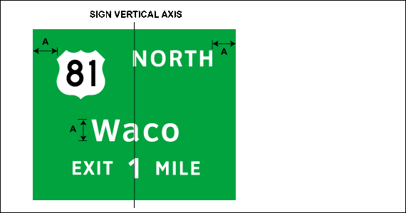
The lateral spacing to the vertical borders must be the same as the height of the largest letter used on the sign. The lateral spacing must be applied to the longest line of copy, and each of the remaining lines of copy must be centered within the sign borders (Figure 4 49).
Figure 4-49. Lateral spacing to the vertical borders.
Anchor: #i1008851Horizontal and Vertical Separator Lines
Horizontal and vertical separator lines are used to separate street names, designations, destinations, and lane assignment on certain types of signs. The separator lines should be fabricated from the identical sign border material as the parent sign, and should not be wider than the sign border width (typically 2 inches).
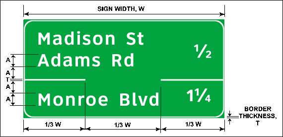
Partial horizontal lines are used to separate street names sharing an exit on an Interchange Sequence Series sign. The horizontal line should be placed in between the appropriate lines of copy. The vertical spacing between a line of copy and the horizontal line should be equal to the largest character (letter or numeral) in the line of copy (Figure 4-50). The partial horizontal line should extend one-third of the sign width (including border) from both sides of the sign (Figure 4-50).
Figure 4-50. Spacing and placement of partial horizontal separator line.
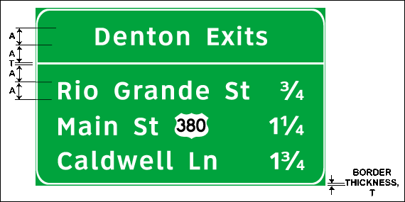
Horizontal lines may also be used to separate a suburban or rural designation on a community interchanges identification sign (Figure 4-51). For this case, the horizontal line should extend the entire width of the sign. The vertical spacing between a line of copy and the horizontal lines should be equal to the largest character (letter or numeral) in the line of copy.
Figure 4-51. Spacing and placement of a full horizontal separator line.
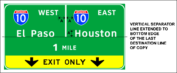
Vertical separator lines are used to separate lane assignment on ramps downstream of multi-lane exits. They are used on single panel, overhead Advance Guide and Exit Direction signs to separate destinations, highways, or cardinal directions. The lateral spacing to the vertical line edge should be equal to the height of the largest letter used on the sign (Figure 4-52). If the lane assignment shares the same destination information, the vertical line should extend from the top of the sign to the bottom edge of the last destination line of copy.
Figure 4-52. Spacing and placement of partial vertical separator line.
Anchor: #i1008914Final Length and Height Adjustment
The length of the message, lettering size, and letter spacing usually determine sign size; however, several other factors can influence a sign’s dimensions. For example, the size of overhead signs may be limited by the amount of available space, particularly if the sign must be mounted over a specific lane. The size of available materials for constructing the sign may also act to limit the shape of the sign. The designer must weigh these factors in order to determine the final size of the sign; however, all previous guidelines should be adhered to.
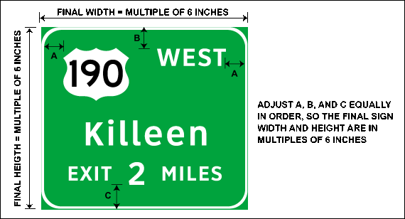
A border should be added to all edges of the sign (typically 2 inches). Final overall sign length and height should then be adjusted from calculated measurement to the nearest multiple of 6 inches. Adjustment of overall length and height should be equally divided between the border and the nearest line of copy (Figure 4-53). As previously mentioned, the corners of all sign borders should be rounded with a corner radius (typically 12 inches).
Figure 4-53. Final length and height adjustment of a freeway guide sign.
